Pmw.ButtonBox() - manager megawidget for buttons
A button box is a container megawidget which manages a number of buttons. One of these buttons may be specified as the default and it will be displayed with the platform specific appearance for a default button. The buttons may be laid out either horizontally or vertically.
If None, a label component is not created. The default is None.
add() and
insert() methods. If there is no label component, then no
frame component is created and the hull component acts as the
container. By default, this component is a tkinter.Frame.
Button components are created dynamically by the add() and
insert() methods. By default, the buttons are of type
tkinter.Button and are created with a component group of
Button.
index() method.
index() method.
If forInsert is true, Pmw.END returns the number of buttons rather than the index of the last button.
index() method. Any keyword arguments present
will be passed to the constructor when creating the button. If
the text keyword argument is not given, the text option of the
button defaults to componentName. To add a button to the end of
the button box, use add(). The method returns the component
widget.
index() method.
index() method.
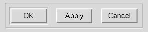
class Demo:
    def __init__(self, parent):
        # Create and pack the ButtonBox.
        self.buttonBox = Pmw.ButtonBox(parent,
                labelpos = 'nw',
                label_text = 'ButtonBox:',
                frame_borderwidth = 2,
                frame_relief = 'groove')
        self.buttonBox.pack(fill = 'both', expand = 1, padx = 10, pady = 10)

        # Add some buttons to the ButtonBox.
        self.buttonBox.add('OK', command = self.ok)
        self.buttonBox.add('Apply', command = self.apply)
        self.buttonBox.add('Cancel', command = self.cancel)

        # Set the default button (the one executed when <Return> is hit).
        self.buttonBox.setdefault('OK')
        parent.bind('<Return>', self._processReturnKey)
        parent.focus_set()

        # Make all the buttons the same width.
        self.buttonBox.alignbuttons()

    def _processReturnKey(self, event):
        self.buttonBox.invoke()

    def ok(self):
        print('You clicked on OK')

    def apply(self):
        print('You clicked on Apply')

    def cancel(self):
        print('You clicked on Cancel')
Pmw 2.1 -
31 Dec 2020
- Home
Manual page last reviewed: 24 May 1998